Basket experience and checkout process revamp
Print on demand company | 2 months | UX/UI, research, usability testing

Discovering the challenge
When I began my role as a product designer at a print-on-demand company, one of my initial tasks was to conduct a thorough review of our website and provide a fresh perspective on its performance. Having a new set of eyes on a product is always beneficial, and I identified a critical area needing improvement: the checkout process. This process, I observed, was unnecessarily nerve-wracking for users to complete. Recognizing that the checkout experience is a crucial element in the customer journey, our team agreed to focus our efforts on improving this aspect of the site.
" 91% of consumers report that a satisfying checkout experience significantly influences their decision to return to a merchant "
* PYMNTS and Checkout.com collaboration based on surveys of over 2,000 consumers.
I. Designing the Right Thing
I utilized the Double Diamond process for the project, a design methodology encompassing four phases: Discover, Define, Develop, and Deliver. This approach ensures a deep understanding of the problem through broad exploration and focused problem-solving, leading to innovative solutions and effective outcomes. It's particularly effective for creating impactful, user-centric designs.

Secondary Research
Objective: To gather first insights into user behavior using existing data and identify pain points in the current system.
I started the research process with HotJar and Google Analytics, using the data to gain initial insights into user behavior. By analyzing session recordings, heatmaps, reviews, and scroll data, I uncovered several challenges. This method offered a first look at the checkout experience, guiding efforts toward meaningful improvements.


Competitor Analysis
Objective: To benchmark against leading competitors or top market players, identifying industry trends and best practices.
I reviewed several competitors, focusing on their basket and checkout experiences to determine their strengths and weaknesses relative to our own. I often utilize a competitor analysis approach to understand industry trends and identify patterns. It's especially useful when time is limited, serving as a helpful step. It's important to remember, though, that not all observed patterns are necessarily the right ones to follow. However, they provide a solid foundation for testing and refining assumptions.

Heuristic Evaluation
Objective: To evaluate the usability of the current basket and checkout process against established usability principles.
In my projects, I typically use an approach known as the heuristic markup, a variant of heuristic evaluation. This method includes intuitively assessing the interface by navigating through the flow. It combines adherence to established usability heuristics with personal insights and reactions one has during interaction with the system. This dual focus ensures a comprehensive evaluation, balancing objective usability principles with subjective user experience.

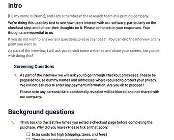
Usability Testing
Objective: To observe real users interacting with the investigated flow and gather direct feedback.
I conducted tests with 5 participants, both moderated and unmoderated, using a platform usertesting.com. This helped identify specific obstacles and areas for improvement in the user experience. Starting with real-world data eliminates guesswork and biases, offering a solid foundation for identifying and addressing the core issues. Leveraging this information enhances the likelihood of accurately pinpointing the root cause of the problem and detecting effective solutions.
Process includes: creating a usability testing plan, preparing a template for unmoderated usability testing on the platform, conducting live usability sessions, and analyzing gathered data.


Information Synthesis
These activities helped to discover user pain points and opportunities for enhancement. Through affinity mapping, I analyzed the data and created a list of features for improving usability, and the Kano Model activity was used to prioritize these features. The forthcoming phase will focus on refining the design to tackle these challenges and enrich the user experience.


Additionally, this is good to share findings with the broader team at this step, ensuring everyone is informed and engaged with the latest insights. This fosters a collaborative environment and encourages collective input on the proposed enhancements.

II. Designing the Thing Right
This stage focuses on refining solutions that meet user needs and business goals. This stage is about evolving concepts into actionable, user-centered designs through prototyping and iterative feedback, ensuring the end product is both effective and engaging.
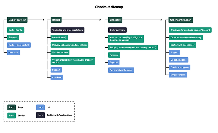
Sitemap
Objective: Map out all the pages, steps, and sections involved in the checkout process on the website and visualize the user's journey from basket to order completion.
Feature Map
Objective: Identifying key features necessary for a seamless basket and checkout experience, ensuring all essential elements were included in the redesign.

User Flow
Objective: Develop a revamped user flow based on research findings.

I.I. Prototyping
Due to the massive nature of this phase, I've added it to the subsection. The main challenge at this stage may be deciding where to begin, considering the extensive data and artifacts collected. To simplify, I suggest starting by listing user flows.

This list also helped the engineering team effectively track the UX process and the status of flows. Additionally, including links to each flow within the Figma file facilitated easier navigation withing the design file.
Basket prototype
Current

Updated


Checkout prototype
Current

Updated


Registration page prototype
During the checkout overhaul, it was proposed to improve the sign-in process due to technical limitations on guest checkout, aiming to integrate it seamlessly with the shopping journey.
Current

Updated


Final words
In concluding this UX case study, I've walked through the steps I took to identify challenges to prototyping solutions, laying the groundwork for the next crucial steps: testing the outcome with users, gathering feedback, and iterating on the design. This iterative cycle of feedback and improvement will guide us toward a more intuitive and efficient product, ultimately driving better engagement and conversion rates.
" Through design, we transform complexity into simplicity. Our journey continues beyond prototypes, towards crafting experiences that truly resonate."